Basic Grading Criteria (10 pt max)
- First Setup/Onboarding: 1
- Adding Favicon without needing to convert:
- Guide/method for tracking analytics (visits): 3
- Setup guide for custom URL: 0
- Dark mode/theming:
- ‘Wow’ factor: 3
Please sign up with my affiliate link: https://feather.so/?via=af123
On support - Phenomenal. 10/10. As I was setting up, I got a ping asking if I needed help. I’m really impressed by the build in public attitude, and support after I finished my review.
I tried this one in late 2022, since then, the home page has seen some visible improvements. Let’s dive in and see what else is new.
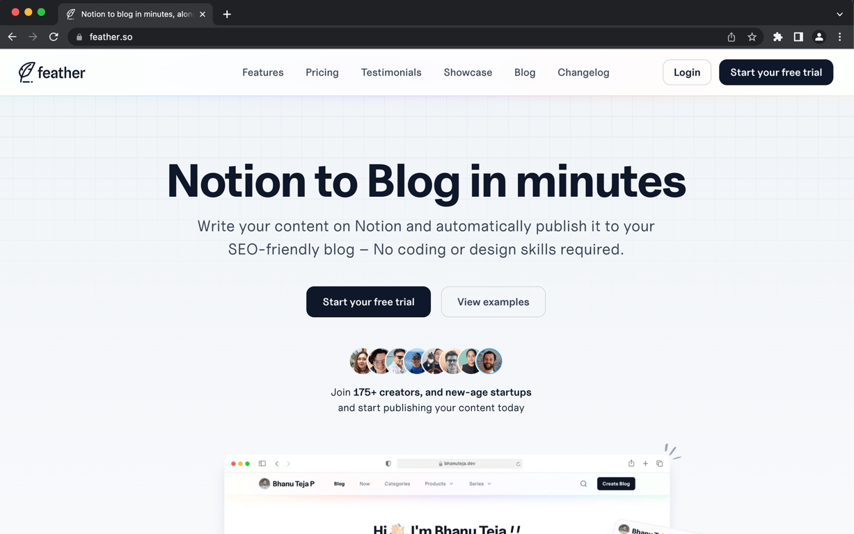
I love this landing page. The person icons are really welcoming and provide some solid social proof. I think a drop shadow (or coloured drop-shadow like pricing) would make them pop for me. (Right now, they have white frame on white background.)
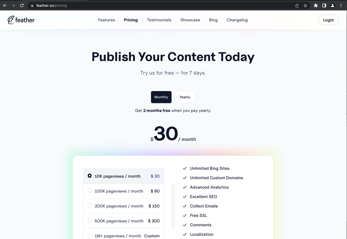
After clicking on ‘Start your free Trial’, it took me here. Frankly, it’s quite off putting. If I wasn’t testing this, I would have clicked away here. It feels like I’m going to get charged when the price is thrown in my face right at the start. (If you’ve seen the other tools listed, you’ll see that usually the ‘ask’ for price is at the very end.)
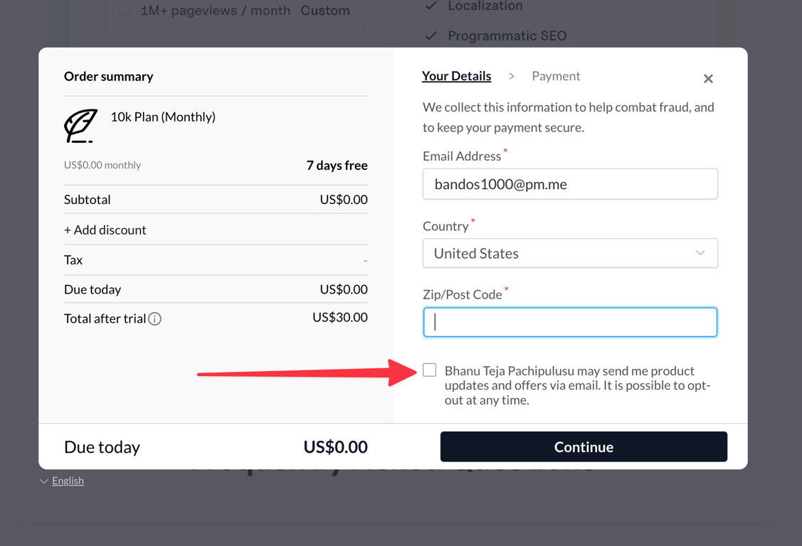
So…clicking on free trial takes me here. Again, no value has been provided to me, so it’s a bit of a tall ask to give away my information. I’m also (I know this is the founder from Twitter) a bit hesitant to give Bhanu the ability to send me product updates. Again, I haven’t seen the value yet.
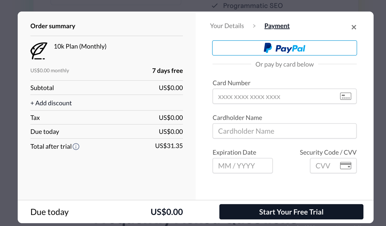
Adding Apple/Google Pay here could boost conversions. This is now a $30 USD risk. I’m glad my cards have purchase protection. (I’m gun shy, after dealing with another low-code project that the founders abandoned w/no option of payment cancellation.)
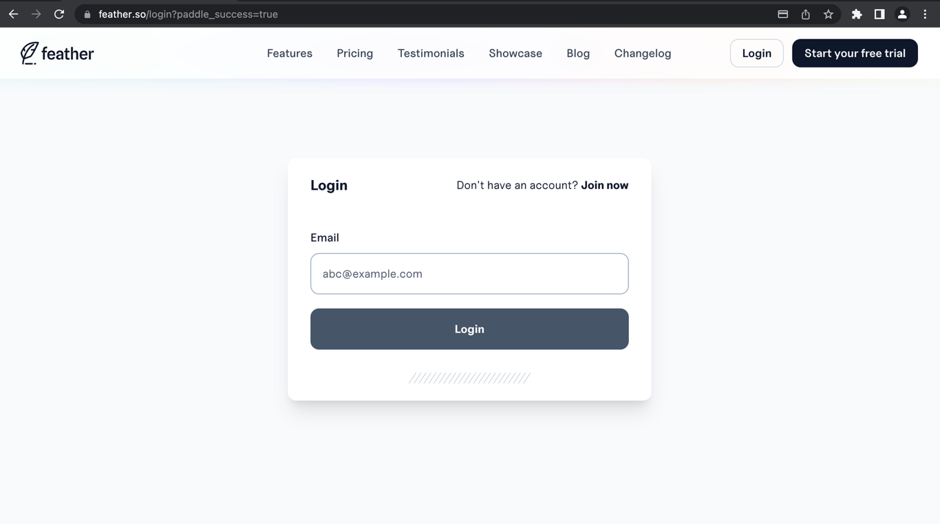
Now I’m a bit confused. My payment went through, but now I have to create an account? Do I already have a login from providing my payment info? Why wasn’t I able to create an account at the start?
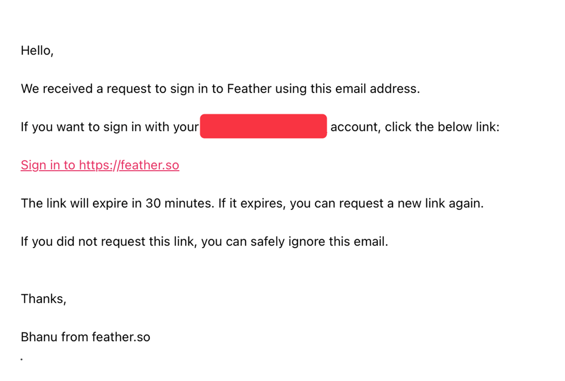
I was able to put in my email on the above, and got a bit of confetti celebration 🎉 That was fun. Here’s the email confirmation I got. I would just offer a whole hyperlink (W/the custom link) or do a click here hyperlink.
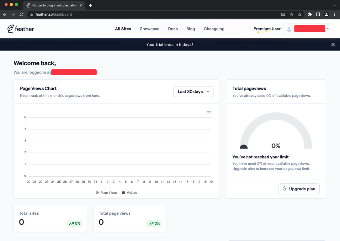
Ok! After 5-10 minutes, we made it to the dashboard. Whew! Now let’s create a site and get testing.
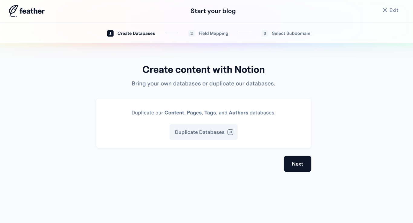
Clicked on create blog at the bottom, and now am presented with this. I don’t know what a database is. But let’s roll with it.
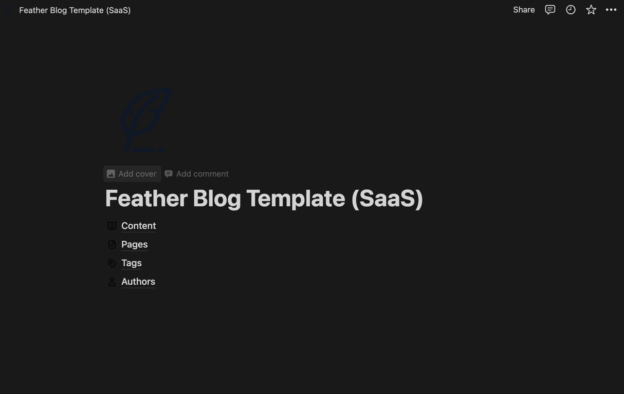
Clicked on ‘Duplicate Database’ above and was taken here. I’m not 100% sure on what duplicating each of these looks like. It appears as if I’ve already duplicated the page, so hopefully that’s good enough.
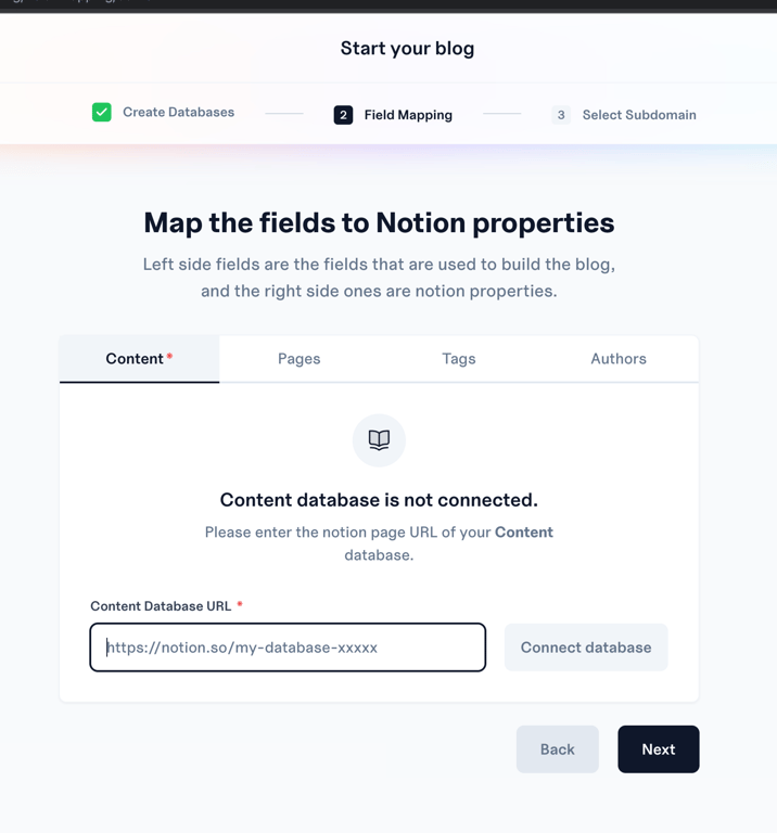
I’m going to break the rules and attempt to stick to the criteria I’ve previously laid out. (In Notion Competition 2023 with the other tools.)
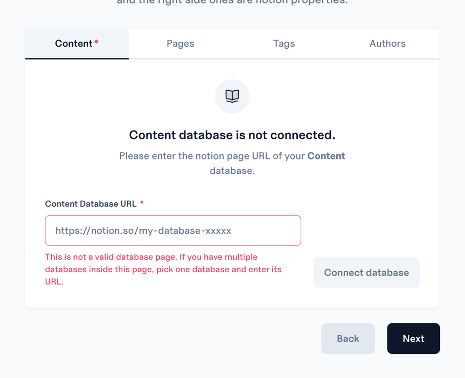
As expected, it got mad at me when I tried to link to the page above. We’ll just do the database within the page Initiatives to keep it ‘fair’.
Ok…Moving this next one to an expand.
This is the huge form for field mapping.

This is a LOT for me, as a new user. I don’t understand a solid 40% of this. 😅
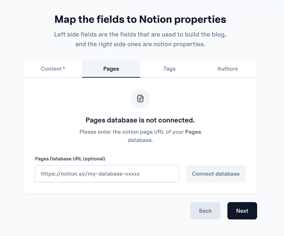
So it looks like each time I click next, it takes me to a new tab. I must note - This isn’t super intuitive. If only content is mandatory, I expect next to take me to the next step.
I’m not super clear on what the difference is between content, pages, and tags. But I am not a blogger. 😄
Here’s a gif example of what I mean by the above. I could be totally off.
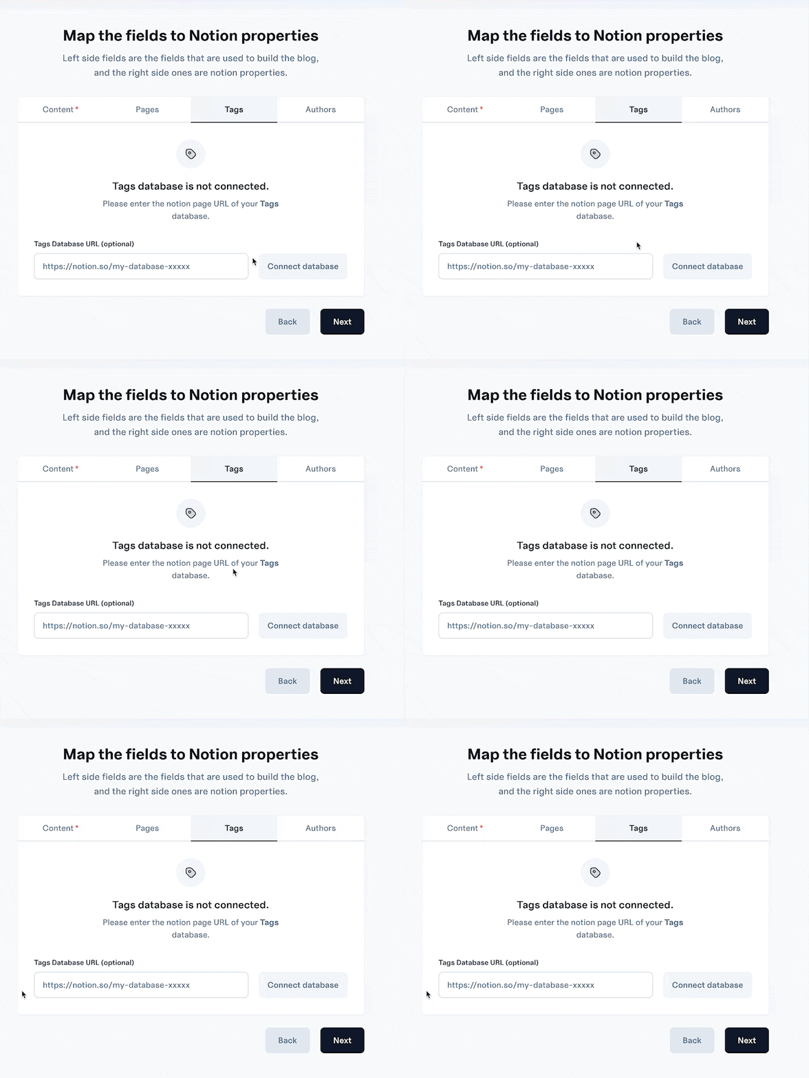
Gif example of what I described above. I think this behaviour is ok if this was the only form, but this is a form within a form process.
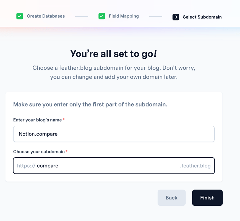
And we’re OFF! Let’s do this. The loading colours on the top bar, and the confetti after I created this, looks SOLID. Really enjoying the UI on this tool.
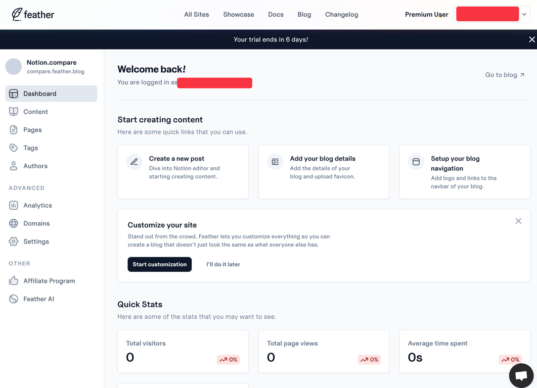
We made it to a new dashboard of a specific site. (Blog?)
I’m going to do something a bit unorthodox for these reviews and make a gif of the dashboard. (Got distracted at the end.)
But before that gif, let’s test the link -
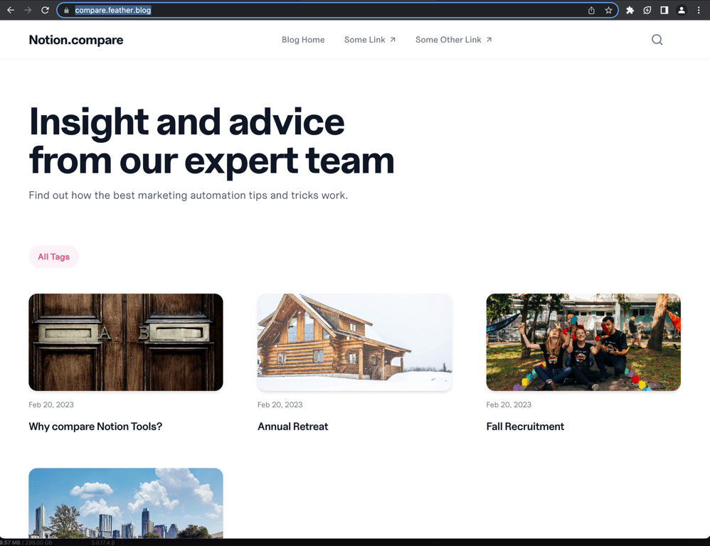
We are live! I’m really impressed by 2 things. 1) I absolutely did not pay attention during setup. I didn’t use the duplicate database, I didn’t follow directions. 2) It looks really solid. I would be able to send this to a client with a few small changes. The rounding + drop shadows looks great.
Dashboard gif as promised:
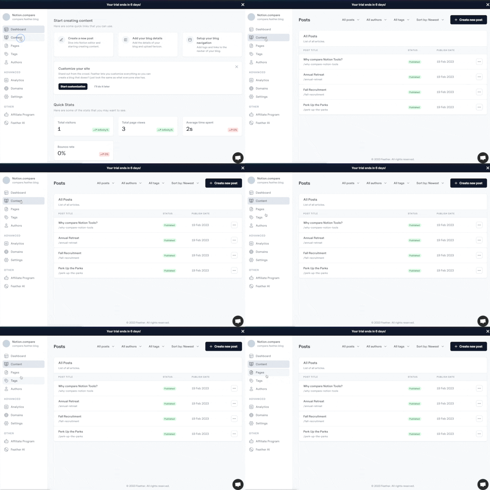
Pretty solid layout. I dig the built in analytics. I am curious if they are CCPA/GDPR compliant, and would love that tagged at the bottom.
Audit time -
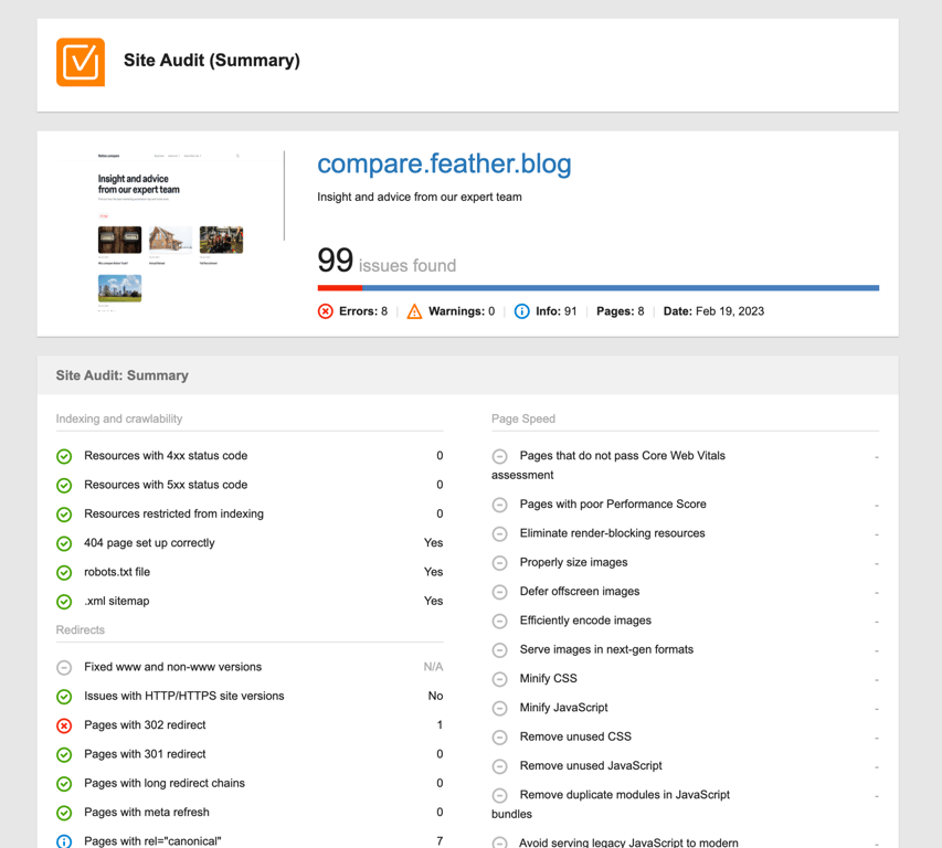
Digging into this, it’s mostly my own fault. If I added meta-descriptions, and put a bit more time into setup, it wouldn’t be close to this level of issues. (E.g. some of the ‘errors’ are empty alt text, duplicate descriptions, etc. All my own doing from the poor setup.)
In terms of performance, I expect it to do well due to no banner image + very custom format:
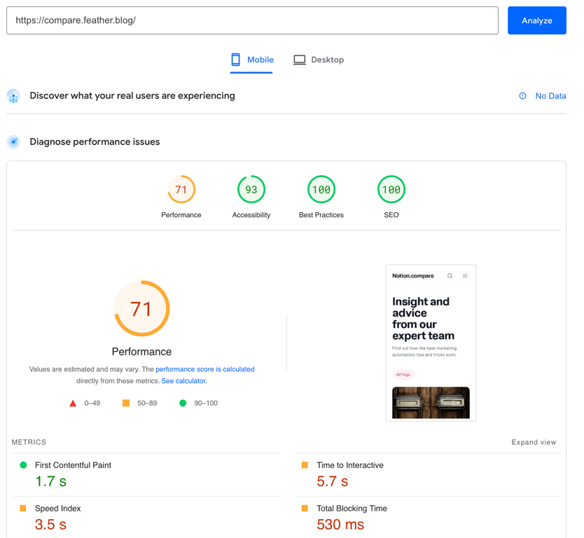
Did pretty well, I would expect a bit faster since it’s all Feather content, but still higher than most tools we’ve tested.
Wrapping up, I’m really impressed. I know I said Cloakist was a professional tool, but Feather is far above it for any bloggers or content writers. (And has faster loading speed/performance.)
I think Feather could stand out with a bit more of a streamlined setup. (Even if that’s a on-call 10 min consultation/screenshare for initial setup.)
Flashback to the pricing screen:
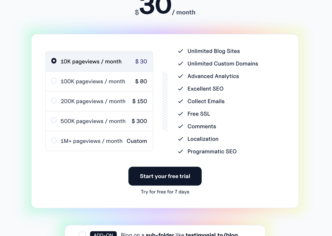
I would say my score increases a LOT if I’m given the ability to add pages/non-databases and host pages. (Just for the UI alone, I would pay $5/site/month. Built in analytics and more? Love it!)
I would say my onboarding score increases if I can test this on a page or 2 without payment.
I feel the niche is for any blogger (big or small) but most suited for blogging teams.
This would be my first choice if I was:
- Running a content team
- Running content for a company (of any size)
- Managing a team of writers.
Affiliate link: https://feather.so/?via=af123
Like this review or want to see it updated? Get in touch with me on Twitter: @Bandos_1000
Disclaimer: The information provided on this website is for general informational purposes only and should not be construed as medical advice, legal advice, or professional advice of any kind. The website owner is not a medical professional, and the information provided on this website should not be used as a substitute for medical advice from a licensed healthcare provider.
Affiliate Disclaimer: Some of the links on this website are affiliate links, which means that the website owner may earn a commission if you click on the link and make a purchase. The website owner recommends products or services that he/she believes will be of value to the website users, and any commission earned helps to support the website creator or team.
Copyright Notice: The content on this website, including text, images, graphics, and other materials, may be protected by copyright laws unless otherwise noted. The website user may not reproduce, distribute, or modify any of the content on this website without the prior written consent of any applicable parties.
Fair Use: This website may contain copyrighted material that has not been specifically authorized by the copyright owner. This material is made available for the purposes of criticism, comment, news reporting, teaching, scholarship, or research, which are considered fair use under copyright law. The website owner believes that the use of any such copyrighted material on this website constitutes fair use as defined by the law.
Limitation of Liability: The website owner is not responsible for any actions taken based on the information provided on this website. The website user assumes full responsibility for any consequences resulting from the use of the website. In no event shall the website owner be liable for any damages arising from the use of this website or the information provided herein.
Indemnification: The website user agrees to indemnify and hold the website owner harmless from any and all claims, damages, expenses, and liabilities arising from the use of this website or the information provided herein.